Here are just some of the graphic design principles that designers utilize every day. However, your understanding of them also relies on understanding the mind of a person. There is a reason that these principles work so well. Below are some laws that can explain why.
Hick’s Law of Design
This law explains that people can only consume so much information at once or else they can get cognitive overload. By using the principles of patterns, balance and proximity, you can break up information to present to an audience a little at a time. It’s especially helpful in dealing with digital design when you have so many screens.
Miller’s Law of Design
This law states that to memorize info better, you need to break it up into chunks and organize it.
Jakob’s Law of Design
This law shows that people expect the familiar. The more familiar an interface is to them, the easier it is and the more likely they will stick with it. With this law, think repetition and patterns. More information about the psychology of design can be read here.
Typography
Typography is the font or type that you use in a project. Depending on what it’s about, type plays a huge role in how your design will be perceived by others. Let’s talk about the different kinds that you interact with on a daily basis.
- Serif: Letters characterized by extensions of smaller lines coming off from larger strokes. Also known as Gothic or Roman type.
- Sans Serif: Meaning without serif, they are simply strokes of lines making the typeface. Used in many logos and body texts because it’s simple to read.
- Slab Serif/Egyptian: A kind of serif that is thick and blocky. It was the most popular and invented in the 19th century.
- Script: Fluid and curving like handwriting. Not recommended to use in a body text.
- Black Letter: Similar to script but with thicker strokes. Lord of the Rings, is well known for using black letters.
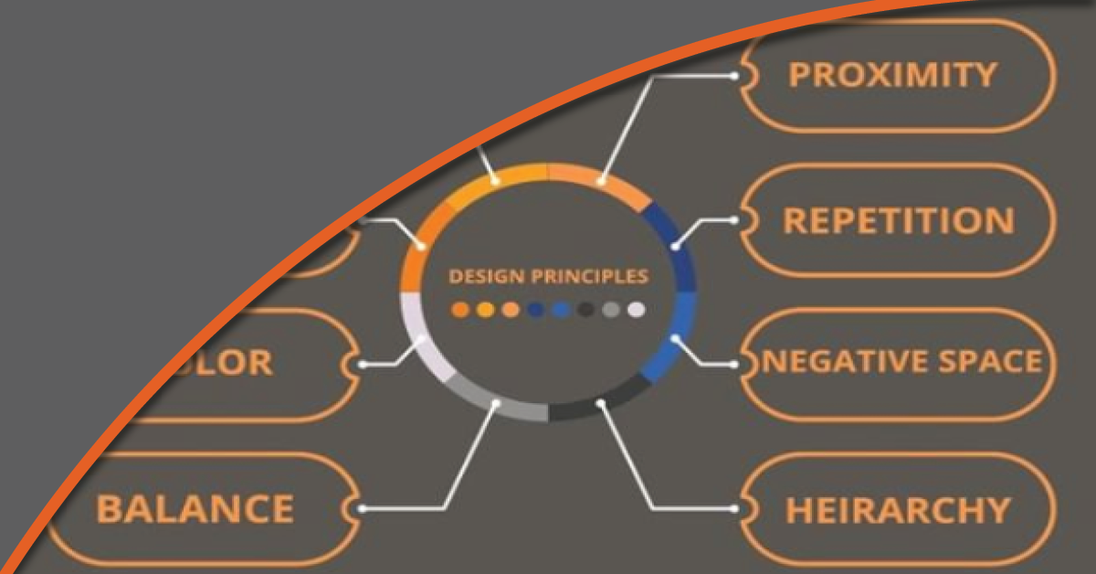
Balance
Having balance within a design helps the feel of the elements that people can see. Sometimes they can be even or at other times one element can be stronger than the other. That is symmetrical and asymmetrical balance. Depending on what is being created, it’s up to the designer what they want to bring focus to with this design principle. Asymmetrical balance helps to draw the eye to the bigger element or the ones that look different.
Proximity
Proximity is how close or far apart something is. The closer the elements, the more the eye will perceive them as one unit. The farther away they are from each other, the elements become solitary.
Alignment
Alignment refers to how well things are lined up on a page in relation to each other. To help with this principle, you can create a grid system to ensure that everything lines up perfectly. To find grids that you can use, visit Visme to help you along the way.
Hierarchy
Hierarchy is how you arrange design elements depending on their importance. The more important something is, the heavier line weight it should have to draw someone to it. Think how flyers are created, they usually have the most important things stand out like the name and events that are happening on the day.
Contrast
Contrast is where two elements in a design oppose each other in some way. They are opposites like light and dark. Colors on the color wheel that are opposite each other like red and green are contrasting as well. Contrast is meant to bring out an element’s characteristics in a bold way to stand out and command attention.
Repetition
It’s the process of repeating elements in a design. Repetition can help give a design a unified appearance and creates consistency. Think about patterns for this principle.
Color
Color is one of the most important principles because it works so closely with the other principles like contrast, repetition, hierarchy and balance. Colors bring life to a design and each one delivers a different meaning.
- Red: Passion, Action, Desire, Anger, Danger, Love
- Orange: Vitality, Energetic, Determination, Productivity
- Yellow: Happy, Energy, Warning, Warmth, Cheerful
- Green: Optimism, Growth, Youth, Relaxation, Wealth, Stability
- Blue: Peace, Loyalty, Integrity, Trust, Refreshing
- Violet: Royal, Peace, Majestic, Spiritual, Ambition, Gloom, Sadness
- Pink: Youth, Tenderness, Love, Playfulness, Feminine
- White: Purity, Softness, Cleanliness, Neutral, Innocence
- Black: Drama, Mystery, Power, Discipline, Authority, Strength, Elegance
- Grey: Formal, Conservative, Moody, Depressing
Negative Space
Negative space is the area around a design that is blank. It’s meant to draw focus to the design itself and help keep the page from being cluttered. With text, it aids in readability. Negative space is intentional and sometimes can even take on a shape of its own. It can be used with visual hierarchy to give emphasis to an item in a work.
While you may not become an expert in design just off of this blog, remember that practicing will help you more than anything. Principles are there to guide you along and help your design reach its full potential.
If you have any questions, head on over to Burkhart Marketing for advice on anything design.